
Vintage labelling: Go back to your roots
Articles
If you are looking to redesign the label for your product, but aren’t sure how to go about it, why not consider taking a step back in time and look at more vintage designs that reflect your company’s heritage?
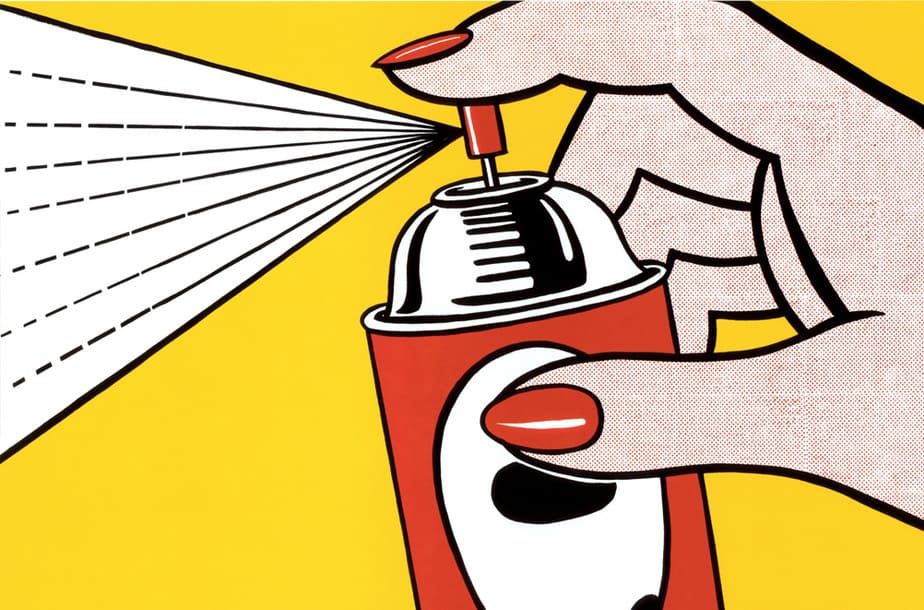
You only have to think of iconic illustrations by Lichtenstein or propaganda posters from the war to see that vintage is extremely engaging from a graphic point of view and employs one key design feature – simplicity.
Only recently, two firms have capitalised on the value of classic simplicity done in a vintage style. After all, it would appear to be one trend that shows no signs of abating in the near future.
Car care brand Simoniz called upon consultancy firm The Market Creative to come up with a new look for its products. Taking inspiration from the original wax tin packaging from the start of the 20th century, when Simoniz had just been founded, the team was able to come up with a classic design that offered a modern twist. All of the brand’s products are now embellished with the simple yet engaging design, making Simoniz truly recognisable among its peers on shop shelves.
In terms of colour, red and gold are almost the only two that are featured on the labels, enhancing the clean design. Simple hues are also used effectively as part of a colour code to denote where on a car the individual products should be used – red for exterior use, green for interior and blue for products that can be used on the tyres and wheels.
“The Simoniz brand was in need of revitalisation and new packaging. In a cluttered and complex car-care category with few norms, Simoniz needed to make its mark, engage shoppers and prove its value to retailers,” the agency said.
Meanwhile, in advance of its launch into the UK market, the packaging for the iconic Danish milk drink Cocio was in need of a facelift and what better way to do so, than to strip back the fuss with a clean, classic label?
Design and innovation agency Dragon Rouge translated the ‘iconic’ element for the UK market, by also using simple colours – red and yellow – to clearly distinguish between the two products and reflect what it referred to as the brand’s “classic cues”.
However, it is the classic, vintage design that is truly eye-catching, brought to life by minimal hues, a single, silver strip running along the bottom edge and a memorable, classic logo.
According to Sara Robinson, insight manager at Arla, which owns Cocio: “Their new simple, clean identity really builds on Cocio’s status as an icon in its native Denmark and connects with young urban adults.
“By really paring back the design, they’ve created a product with real stand-out, that stays true to its heritage.”
If you want help producing a label that will represent your heritage, give us a call today to see how our team of experts can help.
Let's discuss your project.
Whether you have a full brief or just an idea, we'd love to share our expertise with you.
Contact us“Thank you so much for the image its absolutely fantastic, the detail is beautiful! Thank you again you have all been fantastic and so helpful.”
“We have received the parts successfully and am very happy with the job you’ve done. What a great experience it has been doing business with your company...”
“I am just writing to thank you very much for such a fast turnaround on the labels. I really appreciated the excellent service. The labels are perfect in every...”
“We’ve received the parts. Great job, thanks for the excellent service. I’ll be sure to contact Fine Cut for the next job we get!”